donderdag 27 november 2014

Leaderboards and Achievements

In the past two weeks we have experimented with online leaderboards for the Android version of our casual game. Giving players the chance to see the scores of other people (and their friends), instantly makes a casual game a lot more competitive and fun. Online leaderboards were also a request from multiple test users during our evaluations. In this blog post we will go over the challenges we encountered and the results we now have in our casual game.

Research

It was already decided during the first brainstorm session, that leaderboards and achievements were
something we really wanted in our game. That's why we started researching our possibilities early on too. The most popular library we encountered was the Google Play Game Services library. However this required a Google Developer account and although it was possible to use the account of the KU-Leuven HCI department, we decided to look for a free alternative first. 

Swarm

The free alternative we found was Swarm. This library was very easy to integrate into our game, after 20 minutes it was already up and running. At first everything seemed to work just fine. However, it soon became clear that there were some problems with this library, that started to bother us (and some of our testers). We've searched for a way to fix them, but ultimately decided to move on to another leaderboard library. 
The main reasons we chose to drop Swarm were:


  • Players didn't stay logged in consistently. Every time the game was booted up, there was a small chance that players had to manually log in again.
  • Sometimes the leaderboard just refused to go online, even when players were connected to the internet.
  • The leaderboard screen could only be shown in portrait mode (vertical), while the rest of the game is in landscape mode (horizontal).
  • Players that beat their highscore while offline, had it overwritten with their previous highscore when they tried to go online.
  • The popup notification whenever a player submits a score to Swarm, glitched on the phone of one of our testers. It remained visible even after our game had been shut down. This tester had to reboot his phone to make it go away.
  • The look of the leaderboard didn't match the look of our game at all.


Swarm login screen
Swarm leaderboards
Swarm notification glitch

Google Play Game Services

While experimenting with Swarm, we released DinoTopHat on the Google Play Store through the Google Developer account of the KU-Leuven HCI department. Since now our game was already published on the Google Play Store, it required much less extra effort to get started with Google Play Game Services (GPGS) than before. This is why we decided to have a go at implementing our leaderboards with this library. We also discovered that if you want to use the GPGS  library, it was necessary to register at least five ingame achievements. Thus it was decided that we would make use of this opportunity and implement the achievements along with the leaderboard. Just like the Swarm leaderboards, implementing the GPGS leaderboard was pretty straightforward. We also added 9 achievements and are very pleased with the result. The leaderboard looks better and all other issues we had with Swarm also seem to be fixed.

GPGS login screen

GPGS leaderboards

GPGS achievements

zaterdag 22 november 2014

Planning

With only 4 weeks left on the clock it's important that we manage our time well. For this a planning was made and a lot of work still has to be done. Below you can find our schedule on how we plan to improve and evaluate our game.

This weekend (22/11 - 23/11) :
  • Implement extra control schemes (swiping,dragging, tap under/above dino)
  • Implement global high scores + release in the wild (Google play + facebook)
  • Improve feedback from Google Analytics
  • Continue drawing parallax effect graphics
  • Finish up the 3th report on game-mechanics

Week (24/11 -30/11)
  • New evaluation of the controls
  • Make a report of the evaluation (should be finished Wednesday)
  • Continue drawing parallax effect graphics + start drawing of the day/night cycle graphics
Week (1/12 - 7/12)
  • Improve multiplier explanation + rework the tutorial
  • New evaluation of the tutorial and multiplier
  • Make a report of the evaluation (should be finished Wednesday)

Week (8/12 - 14/12)
  • Implement parallax animation and tweak the game speed and spawn algorithms
  • New evaluation of the game tweaks
  • Make a report of the evaluation (should be finished Wednesday)
  • Included SUS- questionnaire for this evaluation
  • Finalize the game

Week (15/12 - 21/12)
  • Prepare presentation of our game

We'll try to get everything done on this list and give a good presentation about our game!

donderdag 13 november 2014

Report evaluation: Blokoj

This week DinoTopHat will join forces with a fellow student group called "Blokoj". Just like us they had to create a casual game and keep improving it systematically. Now it's time to collaborate and critically analyze each other's evaluation reports in order to obtain a better end product. Blokoj  (and us) should see this as a means of improvement and not as a means to thwart each other's work. Below you'll find a list of good and bad things (according to us) and which things we'll take into consideration for our next evaluation.

Good things:

  • The Goal of the evaluation in report 1 is clear 
  • The sections in report 1 stay on the subject of the report and do not wander off.
  • Phenomenons are clearly explained as are the cause of actions.
  • Report 2: added figures are good and should be done more often.
  • Report 2: Result section is thoroughly written and recap of the results is good (way better than in report 1).
  • It was good that you clearly separated the expert from the other users. Even contacting him a second time to receive more base knowledge was good.


Bad things: 

  • A better kind of lay-out  would improve the readability and different sections (eg.: colors like the appendix).
  • The amount of "we" is very high in both reports, this should be avoided as it almost immediately bothered us when reading the report.
  • The link to the questionnaire in report 1 and the link to the results are broken.
  • The results in report 1 (where the amount is standing between brackets) is very unclear. In report 2 this is handled a bit better. Graphs and box plots should be included for more readability.
  • In report 2 it was unclear why you won't test on desktop anymore (this is just a minor comment).
  • In both reports it seems like you want to test a lot of things at the same time, some might even influence one another. A big part of report 2 is the same as report 1. 
  • Report 2 didn't seem to add much results to report 1 (report 2 was worked out way better but the end conclusion in both reports seemed almost the same). Wouldn't it have been better to immediately add a tutorial (or multiple tutorials) and test in evaluation 2 which one would be better? 
  • Small typo in report 2 page 5 in "praktisch verloop": "Hierna moesten ze enkele vragen te beantwoorden".

Small recap and what to remember:

The first things we noticed while reading the report was the amount of "we", try writing some of these sentences different. The full-black lay-out should be made a little more colorful to increase readability (in our opinion). Adding figures and graphs/box plots for the result section would make a conclusion more visible. Adding these features to a report would increase the quality drastically.

Testing a lot of things at the same time can sometimes lead to unclear parts of an evaluation, smaller reports testing only 1/2 features is key to a clear and well written report.

The reports of DinoTopHat do not hold into account all of the above. The students of Blokoj might find other things important that we did not notice. Their critical evaluation will be key for improving our reports even further and we hope that our evaluation can aid their cause.

woensdag 12 november 2014

Big wall of text known as the recap of our evaluations

Introduction

Taking a systematical approach to improving our casual game is important as to not lose sight of the bigger picture and get caught up polishing some minor feature that is considered unimportant by users.
Let's start off with recapping our current work and summarize our findings so far. We will then look at the important aspects of our game, and determine the current state of our game. Finally we look at the road map that we have planned for our game.This should create a solid foundation on which to polish our game even further!

So what have we done so far. We developed a minimum viable product, and did two evaluations of it. In between these evaluations we added some additional content, mainly improving the core game mechanics. 

First evaluation

In the first evaluation we explored the possibilities of the touch-screen controls, focusing on determining a "perfect" control scheme. This evaluation was done with a small set of fellow students. 
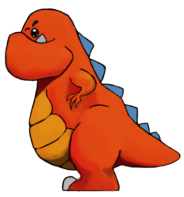
At this point we decided to test two tapping control schemes, one where a left tap moved the dinosaur up, and a right tap moved it a lane down, and its inverse. 
Our conclusion was that left tap - up, right tap - down was most natural. Furthermore people suggested swiping and clicking on lanes to switch as methods for controlling your top-hat dinosaur. 
At this point we were somewhat convinced that we were on a good path with the control schemes, however due to the small number of participants we deemed it necessary to substantiate these conclusions with a bigger test, involving more participants.

Second evaluation

In the second evaluation we got a total of 22 people to answer a questionnaire about our control schemes, we also added a third tapping control scheme, with a tap on the top of the screen moving the dinosaur up, and a tap on the bottom side of the screen moving the dinosaur down. 
We expected that the results would collaborate our first conclusions, however, this was not necessarily the case. While people did seem to have a small preference for the control scheme put forward in the first evaluation, they did not fully dismiss the other control schemes. 
Furthermore a lot of people again considered swiping, and instant lane switching as possible options for other control schemes. 
At this point we decided to keep all three control schemes in the game. We will keep the other possibilities in mind, while we first focus on other aspects of our game. If time permits we will do another evaluation, which will have these other two suggested control schemes included.

Furthermore during the first evaluation, we noticed that people found several game mechanics somewhat confusing.  At the beginning we assumed that with the principle of learning by dying people would understand quickly enough what to do. This however was not necessarily the case, whether this was due to the game not having enough visual cues to what was happening, or this being a bad assumption is not yet explored. We decided to add a small tutorial screen to the game to improve the learnability, which was evaluated during the second evaluation. We concluded however that this did not minimize the learnability completely, and room for improvement still exists. At this moment players found both the scoring and the dodging of obstacles confusing. Further improvements and evaluations will help reduce this problem.

Simple breakdown of casual games.

Before we move to a proper analysis of both the current and future situation, let's first break down our game into several bite-sized chunks that provide us with handles to evaluate the different parts. 

We'll divide the game in three important parts.

Core game mechanics.


Core Game-mechanics
Rules Schedules Tokens


Rules describe the rules of the game. In our case these would be :
  • If you eat a small dino you increase your score.
  • If you run into a big dino you die.
  • If you run into an obstacle you die.
  • You can only move to adjacent lanes.
Schedules  describe when events happen
  • After x time the game speeds up
  • After x time the multiplier increases.
Tokens describe points, in-game currency etc.
  • The score
  • The amount of eaten small dinosaurs.

Interaction Mechanics


Interaction Mechanics
Control Schemes Interaction Menu navigation

Control schemes describe the static control schemes of input.

the touch screen devices:
  • left - up, right - down
  • left - down, right - up
  • top - up, bottom - down
Keyboard devices:
  • 'w' - up, 'a' - down
  • 'up' - up, 'down' - down
Interaction describes how users use the control schemes.

Aesthetics


Aesthetics
Visual Aesthetics Sound
Menus Game-Mechanics Music Interaction

Aesthetics describe the look and feel of a game.  
Visually includes the menu and the representation of the current game mechanics. Sound is the background music, and the sound associated with interaction.

We can evaluate different aspects of these three major subsets according to the criteria.

Current State

Given this breakdown into three areas, what is the current state of this project:
So far we have evaluated the interaction mechanics of our game on touch-screen devices.

We have also evaluated the learnability of our game-mechanics, and found several problem areas that could benefit from improvement.

Now you could ask "Why would you evaluate the learnability before evaluating if people actually like your game, and its game mechanics?"
The answer has an element of the chicken and the egg in it. On the one hand the game-mechanics need to be fun before you spend time on improving the learnability, but on the other hand can game-mechanics truly be fun if they are extremely difficult to learn?

We chose to optimize the learnability first due to several reasons.

  • We noticed during the first evaluation that people seemed to enjoy playing the game, and were neither bored nor extremely annoyed. Playing the game ourselves, we came to the same conclusion, the game-mechanics are enjoyable.
  • Casual games have a small retention rate. If gamers do not understand the goals of a game, they will most likely just install a different game, instead of trying to understand the goals designed by the developers. So it is important to minimize the learnability.
  • Having people understand the mechanics allows them to give better feedback on the actual (intended) game-mechanics.
Of course opting for this strategy has drawbacks. Most importantly you could theoretically waste resources by creating, optimizing and evaluating the learnability of a game-mechanic, that later on in the development process gets canned, when the actual game mechanics are evaluated. 

However when a game mechanic really takes too long to improve, or users find it hard to understand, it needs to be evaluated whether the game-mechanic in itself is working. Thus opting for this strategy also acts as a preliminary evaluation to explore which game-mechanics work, and which do not.

So far we have found that the learnability of the game could be decreased. The areas that were mentioned most often by users, were the multiplier and the dodging of obstacles.

Rough roadmap - Future evaluations and plans.

Our first aim is to have our casual game released 'in the wild', which will mean releasing a web-browser and android version of our games, and spreading the word about this release on social media. We will not release an iOS version, due to the notorious slow process it takes to actually get an app released on the app store. 

Before we can do this release we want to incorporate some form of analytics. At this moment we are looking at the google play game services, which should allow us to track different kind of statistics when people play our game. 

Furthermore we wish to work on several of the problems that surfaced in our first learnability evaluation. We identified the main problem to be the scoring and multiplier, and the dodging of obstacles and big dinosaurs. We plan to solve this by improving and possibly redesigning the tutorial. We will also add several visual indicators to the scoring and multiplier. These improvements would need to be evaluated by user testing, once implemented.

Possible longer term areas that could be improved and/or evaluated are (in no particular order):
  • Evaluation and tweaking of the core game mechanics.
  • Experimentation with non-tap game controls on touch-screen devices. These could be for example swiping and instant lane switching.
  • Several proper standardized questionnaires related to the current state of our game.
For future longer term plans, we would like to add evolution/growing as a game-mechanic. We also hope to be able to improve the aesthetics of the game. This would include animations for the different dinosaurs, and a redesign of the looks of the lanes and background of the game.

Of course these plans are only a rough road map, if we encounter any pressing problems these will get priority.

TL;DR:

So far we have done two evaluations in which we explored the controls of touch-screen devices and the learnability of our current game. 

At this point we decided to incorporate three different control scheme lay-outs, and we will experiment more with other schemes as well.

We learned that the learnability of our game could be decreased. We plan on doing this by adding visual elements to scoring, and improving the tutorial. 

In the future we would like to evaluate the core game-mechanics, do more testing related to the controls and do several standardized tests to see how our game performs. 

dinsdag 11 november 2014

Implementation: The road so far

In this blogpost we will look back at the implementation of our digital prototype and how it evolved to what it is today. Now that DinoTopHat has set its first steps into the world with our release through social media, it seemed like a good idea to already have a little recap of where we came from, where we are now and where we want to go with DinoTopHat. That's why we will go over the implementation in this blogpost.

In the first session we decided to look at the Libgdx development framework for the implementation of our game. Since none of us had any experience developing games with Libgdx, we started out by learning how to work with it. One of the first things we did after installing it, was implementing a little game described one of the Libgdx tutorials. This game was about catching falling raindrops with a bucket. A screenshot of this game is posted below.
Tutorial Game
This gave us a good view on how to develop games with Libgdx. This game was furthermore easily adjusted to a very early version of a digital prototype for our own game. We needed to change some sprites, introduce the lanes, alter the controls and the first protoype was finished. That way we quickly had a game that visually resembled our first concept art we posted on this blog. Our only goal of making this version was simply to get the hang of Libgdx and maybe to see if the controls we intended to use were feasible. We can't post an actual screenshot of that version, because we no longer have the code.
The first concept art
In one of the next sessions we started building and evaluating the paper prototype for our casual game. This way we decided which other screens we wanted to put in the game and which features we would be adding to our first official digital prototype. So we set out to implement all features we had in mind and a week later our first official digital prototype was finished. The most important features we added were (with screenshots below):

  • A Home Menu with buttons to play, view the higscores and mute the game.
  • A Highscores screen displaying the five best scores on your device.
  • Jungle themed music by SilverPoyozo.
  • Big dinos and palm trees.
  • Increasing speed and spawn rate.
  • Custom sprites, backgrounds and button textures.
  • A simple tutorial intended to explain the controls.
  • A Game Over screen displaying the current score, highest score and a retry button.
  • The player died if he let a small dino escape or if he got hit by a big dino or a tree.
Home Menu
Highscores Screen
Tutorial Screen
Play Screen
Game Over Screen
Since then we have further improved our digital prototype in several ways, into the casual game we have today. Not only the gameplay itself was changed, but also the code behind it. We refactored our code to be much more object-oriented, extendable and readable. This problem arose because we were still building our first digital prototype on the code we got from the Raindrop Libgdx tutorial. This was something we needed to fix as soon as possible, before it would become a bigger problem later on in the development process. Features we added since our first official digital prototype are:
  • Updated sprites.
  • Eat and Death sound effects.
  • Improved IO for storing highscores.
  • Better gameplay balance and hitboxes.
  • Score multiplier system:
    • Eating many small dinos in a row increases the multiplier.
    • Missing a small dino resets the multiplier to the base multiplier.
    • Surviving long increases the base multiplier.
    • eg.: Eating a small dino while having a multiplier of 3 gives you +3 score instead of +1.
  • Slightly improved tutorial.
  • Multiple control schemes.
Control Selection
Improved Tutorial Screen
New Play Screen
This is the version of the game we used to gather results from our first test subjects and also the version we released through social media. DinoTopHat has already come far, but still has a long road ahead of it, but that's a story for a different blogpost. 

Stay tuned for more!

maandag 10 november 2014

Paper session look back

In this week's session all students had to read a paper of their choice from the following website:

http://dl.acm.org/citation.cfm?id=2639189

Since we are evaluating our game it is a good idea to look at some other papers and how they handled their evaluations. The given website provides good articles were some kind of innovative new technology is tested and evaluated. DinoTopHat chose these 3 papers: "Wayfinding for older people with memory decline", "Profiling user experience in digital games using the flow model" and "Lean UX - The Next Generation of User-Centered Agile Development?".  A short powerpoint was made for each one and you can find a link to them in each section.

Wayfinding for older people with memory problems:

link to slides

This paper is about a research team that looks for the best way in aiding older people that have some kind of memory problem in finding their way home. For this they evaluated 2 apps (Home Compass and NavMem explorer) on 13 people from which 8 already had a stroke in the past. The home compass was a simple app that only provides the direction and distance to your home location, how you get there is up to you. The NavMem explorer is a combination of the home compass and turn-by-turn (directions are given at every possible moment)  guiding. You need to pass a list of landmarks to get to your home location.

Most important results and what to remember:

In the slides you can see the different screens from both applications. The ease of use of the home compass was pointed out as a good thing by half of the test users. The displayed text in the NavMem explorer was unreadable by some participants and the displayed text when you arrived was not clear for 3 participants. All in all we'll remember to pursue an easy to use application with fast learnability. The amount of test participants was in this experiment too low since so many different preferences and opinions came to light and all the different circumstances played a part in that. It is important to make the right conclusions depending on the circumstances the test participants are in. When conclusions can not be made with a small user group it is obviously necessary to do more tests/evaluations.

Profiling user experience in digital games using the flow model:

link to slides

This paper is about how the flow model can be used to analys user experience in digital games. Flow is a psychological term used to describe the mental state of a person who is fully immersed in an interesting activity. The flow model can be used to analyse this flow by examining the balance between the challenges the activity poses and the skills of the person participating in the activity. That balance can be divided in 4 channels: Apathy, Anxiety, Boredom and Flow (see image below).
4 channel flow model
The authors of the paper constructed a questionnaire that can be used to measure the psychological subcomponents of these 4 channels (eg.: concentration/motivation/control/etc.). This questionnaire was then filled in by 2 436 gamers and the authors used statistical methods to divide that data into the 4 channels.

Most important results and what to remember:

The authors concluded from their results that the names of the Apathy, Anxiety and Boredom channels, were not the most accurate names for these channels in the context of gaming. In the general model those channels go hand in hand with actual negative emotions (eg.: people in the Boredom channel of other experiments with the flow model were actually bored.), whereas the data from the gamers generally does not point towards these negative emotions. That's why the authors of the paper propose to rename Apathy, Anxiety and Boredom into respectively Impassiveness, Overwhelm and Relaxation (in the context of gaming only). Something we can remember from this paper is that using the flow model to analyse the user experience of our casual game can give us insight in how our players experience our game, so we can evolve it in the right direction.

Lean UX - The Next Generation of User-Centered Agile Development?:

link to slides (pdf)

The authors provide a brief overview of the philosophy of Lean-UX, a next generation framework for developing software in a user-centered fashion. They further give an account of how they implemented several aspects in the company the work.
Lean-UX is build around the design thinking movement, the lean start up method and agile programming practices. The process is based on sprints, with each sprint attempting to deliver a minimum viable product (MVP). These MVPs are evaluated at the end of each development week with user testing.  It is important that all stakeholders are incorporated in the teams working in such sprints.

The authors classified the changes needed to incorporate this model into their way of working into two subsets, team and organisational. They found that within their own teams, the only thing that really required their attention was the integration of more skills within their teams, teaching their UX-developers UX-researching techniques for example.
On the organisational side they found more hurdles, related IT outsourcing and decision making.

Most important results and what to remember:

The concepts of Lean-UX provide a more formal framework for the way we have been developing our casual game. Especially the principles of the lean start-up are interesting to apply more thoroughly. These principles tell us to see a product as a hypothesis for the solution of a problem the consumer might have. In our case the problem would be to have no good way to pass time. Our solution would be our casual game. Defining this hypothesis more clearly would give us a better direction of what we want. Furthermore defining a product as a hypothesis forces us to define when our evaluation rejects or accepts our hypothesis, giving room to a clearer conclusion.
In corporating ideas of Lean-UX should help us create, evaluate and ultimately finish our game faster with less wasted resources.

We will try to use our received knowledge from these papers in our own evaluations to systematically improve our end product!

Art-ifacts: recap of our art-direction

Since our current art has been stable for quite some time, a blog post about the art direction is long overdue. Let me take you a few weeks back in time, when all these decisions were made.
(As a fair warning, this is a long picture heavy post.)

First decision - an art style.

Before you get in the nitty gritty aspects of sketching and painting, we had to settle on the type of sprites our game would use.  This art-style would dictate both the tools, as well as the overall look of the game. Quite important I would say.
Most current casual games that involve characters and are not abstract like pianotiles or dots, either have a cartoony, or a pixel look to them.  We decided to go with a cartoony look as well, slightly inspired by games like angry birds. Though we did not evaluate this decision, we felt that having a cartoony style would appeal to the general public.

The first drawing - Menu background.

The first drawing that was produced, was the menu background. This allowed us to get a rough feeling for the colours, and shading we wanted to use. The drawing itself was inspired by the sketch on the paper prototype menu.

We were not content with our first iteration.


Thus we redid it, which led to the picture currently in use.

Here are some additional images to show a bit of the workflow.


Dino-time - The development of the dinosaurs.

With a general idea of the colours and art style it was time to move to the dinosurs.

A proper design of the dinosaurs is really important. Not only do they have to look good, they have to be readable as well, especially when they quickly move over your screen.
In order to make the dinos look slightly related, we established some rough rules about the design. The smallest one had to look edible and cute, while the big one had to look intimidating. We achieved this by relatively growing the legs/belly/jaw of the dinos more, the bigger they are.

Chicklet Dino.

Lets start with the smallest dino, and work or way up! 
The main requirement of the small dino was that it had to look cute, and edible. We drew inspiration from the chickens you can buy at the local supermarket. 

The following sketches were made to determine a good look for it:


The last picture was cleaned up and coloured blue.
 

The blue colour was chosen because it did not blend with the background, and green and orange were already taken.

TopHat! - our protoganist.

Initially, the only real requirement was that our protoganist had a tophat. A totally valid request, that guided the our design decisions, aesthetic wise. 
                                                                                                                     
The last image again was brought into a drawing program, cleaned up and coloured.


Baddie - The big evil dino.

Last, but not least, our evil bad guy. He had to look threatening and big, like he ate a lot of smaller dinos. With this in mind the following sketches were made.

Using the same workflow as for the other two dinos, the last one was cleaned up, and colored red/orange.


We choose this colour, as it is quite universally associated with danger, which made it a good choice for our bad guy.

We ended up with three quite distinctly shaped dinosaurs, that were usable in our game.

The aesthetic future.

Unfortunately due to time constraints, priorities have shifted away from the artsy-side of the project. But if we do find time to improve it, this is a small list of things we still like to change.
  • Animations! probably unfeasible as it would require a lot more drawings (a simple walk cycle loop on average is around 30 frames, for 3 dinosaurs, would constitute to 90 sketches).
  • Improvement of the lanes and in-game background. 
  • More different looks for dinosaurs, and possible more random objects, like boulders for example. 
  • Particle effects.

zaterdag 1 november 2014

Casual Game Piano Tiles Reviewed

In today's post we're going to talk about something completely different. We are going to review another casual game to see if we can learn something to improve our game. The casual game that is going to be reviewed is called "Piano Tiles".

When launching the game you immediately get this screen below:


The main screen is my least favorite part of the whole game. In my opinion the player gets too many options to choose from but has no idea what any of them mean. After playing some of them however, the names start to make sense. Since we are playing a piano game, the black and white color scheme is straightforward.

Onto the gameplay, which immediately starts after selecting one of  the eight highest buttons on the main screen. The game screen looks like this:


A simple screen that clearly indicates you need to tap the black rectangles. Once you tap, the game starts running and tiles appear from top to bottom. The yellow rectangles with red text are aesthetically ugly, but clearly get the attention from the player to inform him what he must do. 

So the game starts and almost immediately I tap on a white tile, which means I died and the "game over" screen comes up.


You see from the first image that the miss-tapped tile is highlighted red and a red game over screen to indicate you failed. This screenshot was taken in classic mode, where you need to reach a certain point, so no scores were shown. The screen is simple: choose to play again or exit to the main menu. Also a rate button is located on every screen to increase virality of the game.

After a few tries I managed to complete classic mode and as you might have guessed, the screen is green then.


The "win" screen shows you how fast you completed the level and also shows your best score in this gamemode. This way they encourage you to keep playing to beat your highscores. As you can see it only took me 13 seconds, So if you have a few minutes to spare you can easily start and play a few games which is the main goal of casual games.

In conclusion, this game was a pretty fun and decent casual game. It has a fast play style, an increasing difficulty and a variety of game modes. It immediately got me hooked to reach higher and faster scores. The learning curve was very low, just tap a tile, nothing more nothing less. A clear indication that you need to beat your time or  number of tiles tapped. 

The most important thing we learn from this, is that the game needs to be simple. Just a few  taps and you are on your way. Highscores are an important factor to keep players hooked and also the possibility to rate your game is something to consider for our own game. Keeping this in mind we'll continue to improve our game.